
方案调研
- https://blog.csdn.net/m0_37792354/article/details/82012278: 这个方案可以实现, 利用动态切换样式表, 每种主题需要一份样式, 可以实现但后期维护成本高(不考虑);
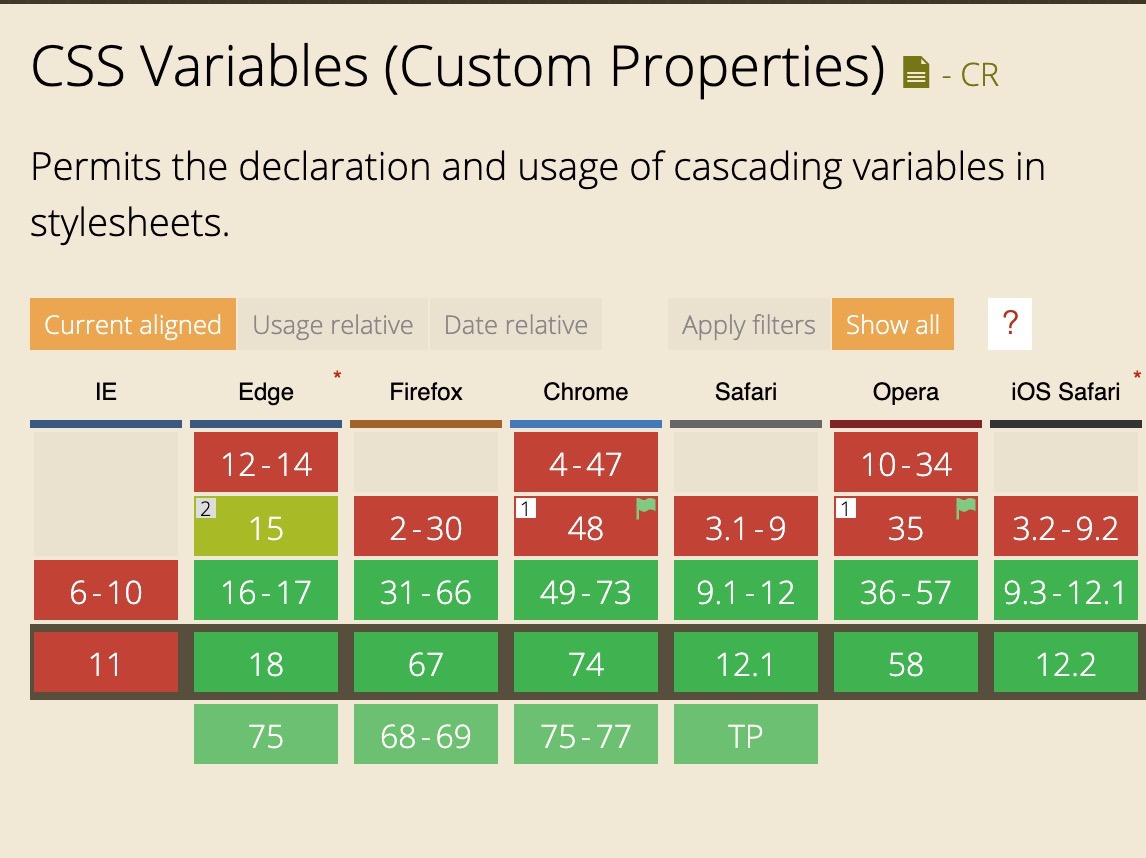
- CSS Variables 的方案, 基于项目本身是 scss 不考虑此种方案, 但是其浏览器支持度还是可以的;
- 入口文件引入自定义变量(参照 antd/饿了么/taro 的方案); 因为组内组件使用了 css module, 所以该方案不能适用我们的业务场景;
- 浏览器端涂色板换色方案;
所以最终方案分为两步:
- 编译阶段在 sass-loader 中注入颜色生成算法;
- 浏览器调色板可以使用 element、taro 的正则替换思路;
antd
- 整理组件将和颜色相关的属性进行整理梳理出一份 default.less;
- 整理一份 color.less 文件, 颜色由 colorPalette.less 动态生成;
用户使用方式:
- 选择一个颜色(切换主题色)
- 下载
- 引用
相关项目
- theme-preview:
- 先把默认主题文件中涉及到颜色的 CSS 值替换成关键词:https://github.com/ElementUI/theme-preview/blob/master/src/app.vue#L250-L274;
- 根据用户选择的主题色生成一系列对应的颜色值:https://github.com/ElementUI/theme-preview/blob/master/src/utils/formula.json;
- 把关键词再换回刚刚生成的相应的颜色值:https://github.com/ElementUI/theme-preview/blob/master/src/utils/color.js;
- 直接在页面上加 style 标签,把生成的样式填进去:https://github.com/ElementUI/theme-preview/blob/master/src/app.vue#L198-L211;
- theme-chalk;
scss 中使用 antd 来自定义主题
如果业务方使用 less/css: 基于 css modules 的 hash 不能覆盖的点,一个方案是本地打好包给业务方使用方案了(兜底方案),但是比较笨重(相当于是要打包出多份不同的 css 样式文件在项目中了, 然后业务方每要一种主题就要新增维护一份打包文件)
如果业务方使用 scss: 如果 css modules hash 不能去掉, 有一个 scss + css variable 的方案可以代替 sass-loader 方案(成本是要写相应的插件); 如果 css modules hash 能去掉, 可以使用之前提到的 taro 上的第一种方案, 在 app 进入的地方引入主题色进行覆盖 scss Variable;
自适应颜色
colorPalette 函数。
RGB 可以方便的进行计算机存储和读取, 但对人进行颜色判断十分不友好, 因此有了 HSB/HSV。
- RGB: 面向硬件
- HSB: 面向用户
HSB(Hue, Saturation, Brightness) 分别表示色调(色相), 饱和度, 亮度。
Version One
version one
$theme-color: #1199ee !default;/* mix white */@function tint($theme-color, $percent) {@return mix(#fff, $theme-color, $percent);}/* mix black */@function shade($theme-color, $percentage) {@return mix(black, $theme-color, $percentage);}/* There are ten color in on theme, from left to right, they are* tint($theme-color, 50%), tint($theme-color, 40%), tint($theme-color, 30%), tint($theme-color, 20%), tint($theme-color, 10%),* $theme-color, shade($theme-color, 10%), shade($theme-color, 20%), shade($theme-color, 30%), shade($theme-color, 40%),*/@function colorPallete1($theme-color) {@return tint($theme-color, 50%);}@function colorPallete2($theme-color) {@return tint($theme-color, 40%);}@function colorPallete3($theme-color) {@return tint($theme-color, 30%);}/* 悬停态 */@function colorPallete4($theme-color) {@return tint($theme-color, 20%);}@function colorPallete5($theme-color) {@return tint($theme-color, 10%);}/* 主色 */@function colorPallete6($theme-color) {@return $theme-color;}@function colorPallete7($theme-color) {@return shade($theme-color, 10%);}/* 点击态 */@function colorPallete8($theme-color) {@return shade($theme-color, 20%);}@function colorPallete9($theme-color) {@return shade($theme-color, 30%);}@function colorPallete10($theme-color) {@return shade($theme-color, 40%);}
Sass 踩坑
sass-loader 的 options 配置要参阅 sass 文档
I think itl's necessary to prompt what features can be used in the options.😄 And the usage of the custom function is found in this issue instead of doc.
设计师的角度
关于悬浮态
悬浮态颜色变浅: hover 相当于按钮被鼠标吸起来了,所以上升后离光源更近,所以变白了。(类似前面某位同学提到的:距离越近越亮
悬浮态颜色变深: 商家/客服显示器很差,Hover 上去底色变亮了字是白的,有些情况影响识别度
参阅资料
CSS Variable
TODO:
- 全局/局部变量
- 或逻辑: var(--a, var(--b))