
背景与边框
以下为与背景与边框相关比较有用的属性。
background-origin: 属性值有border-box/padding-box/content-box。默认为padding-box。background-clip: The background-clip CSS property sets whether an element's background extends underneath its border box, padding box, or content box. 属性值有border-box/padding-box/content-box。默认值为border-box。
边框
- 圆角效果
border-radius
.demo {border-radios: 100px / 10px (水平半径 100, 垂直半径 10)}
- 阴影
box-shadow: X 轴偏移量 Y 轴偏移量 [阴影模糊半径][阴影扩展半径] [阴影颜色][投影方式];- 阴影模糊半径:只能是正值;
- 阴影扩展半径:可以是正负值;
外阴影 x 和 y(正值)出现在右下;内阴影 x 和 y(正值)出现在左上;
图片自适应
.demo {width: 200px;height: 100px;background-size: cover;}
半透明边框
<style>body {background: black;}.translucent-border {width: 100px;height: 100px;border: 10px solid rgba(255, 255, 255, .5);background: white;background-clip: padding-box; /* 这个属性能让背景和边框分离 */}</style><body><div class="translucent-border"></div></body>
效果图
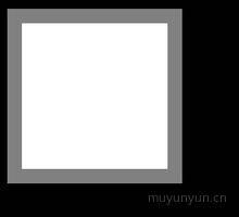
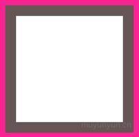
多重边框
- 方案一:
box-shadow
.demo {background: white;box-shadow: 0 0 0 10px #655, 0 0 0 15px deeppink;}
- 方案二:
outline
It seemd no way to set radius with outline.
.demo {background: white;border: 10px solid #655;outline: 5px solid deeppink;}
背景定位
偏移量与容器内边距相同 background-origin 属性用法
使用
calc: calc 使用
.demo {background-position: calc(100% - 20px) calc(100% - 10px) /* calc 里面的 -、+ 前后要各加个空格 */}
- 阅读到边框内圆角