
display(布局)
block: 有宽高, 不在同一行;inline-block: 有宽高,在同一行;(父节点上使用 inline-block 会自动获取子节点的宽度)inline: 无宽高, 在同一行;
inline-block 的问题
Here is demo:
<html lang="en"><style>li {display: inline-block;background: red;overflow: hidden;text-overflow: ellipsis;white-space: nowrap;width: 30px}.demo {width: 90px;}.clearfix {overflow: visible;}</style><body><ul class="demo"><li>testtest</li><li>testtest</li><li>testtest</li><li>testtest</li><li>testtest</li><li>testtest</li></ul></body></html>
I'm confused why is it, I want to use overflow: hidden and not expect the strange gap, how can I do?
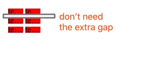
原因是因为代码间的标签符号之间包含空格,浏览器也会处理这部分占位,因此解决方法如下:
The solve way is to add line-height: 0 or font-size: 0 to the class demo and add line-height: 12px or font-size: 12px to the tag li.
position(位置)
- relative: 元素根据正常的文档流相进行定位;
- absolute: 脱离当前文档流, 相对其最近的
position属性值为非static祖先元素进行定位, 直到 body; - fixed: 脱离当前文档流, 相对视窗定位。注意: 当父元素上有这几个属性时,
transform,perspective,filter时, fixed 定位会失效; - sticky: relative 与 fixed 的结合;
使用 sticky 布局有一些限制:
<div><div style="position: sticky; top: 20px; background: pink; margin-top: 50px;">Header</div><div style="height: 1000px">Content</div> // 比如这一行不可或缺</div>
margin
margin 的百分比值是以父元素的宽度作为解析基准的。
自适应内部元素宽度
精确控制表格列宽
.demo {table-layout: fixed; /* 固定表格布局算法 */width: 100%;}
背景占屏幕全宽,内容的长度定宽
.footer {padding: 1em calc(100% - 450px); /* 暗藏内容宽度为 900 px */background: #ccc;}