
flex 基本用法
.demo {flex: 1 1 100px;}
三个值分别为:
flex-grow: 占比, 默认为 0;flex-shrink: 缩减比例, 0 为不缩减, 默认为 1;flex-basis: flex 基本尺寸, 默认为 auto;
How to calculate the flex-shrink
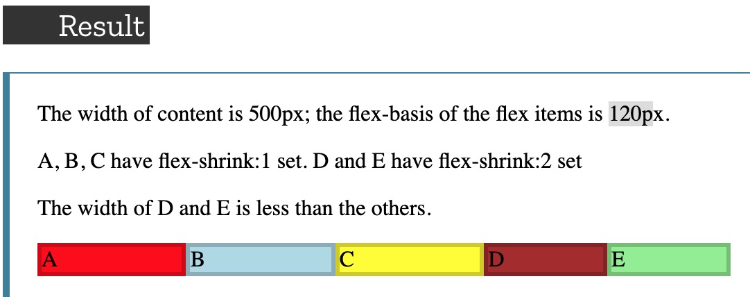
The calculate step is a little difficulty, you can see it in the how-to-calculate-flex-shrink.
justify-content
- space-around: The spacing between each pair of adjacent items is the same, The empty space before the first and after the last item equals
half of the spacebetween each pair of adjacent items. - space-evenly: The spacing between each pair of adjacent items, the main-start edge and the first item, and the main-end edge and the last item,
are all exactly the sam
flex 特殊用法
flex + z-index
- 我们知道
z-index要与定位元素(absolute、relative、absolute、sticky)一起使用, 但使用了 flex 布局后, 尽管仍然是position: static,z-index仍然是生效的。
flex + margin
flex 和 margin 结合使用能达到垂直居中的妙用。
见 水平垂直居中
场景: 右侧图标的导航栏的场景也适用此方式。

方法: 在 flex 布局中, 使用 margin-left: auto。
flex + height: 100%
在 iOS10 以下的 iOS 版本中, 在 flex 布局中不推荐与 height: 100% 一起连用;
- 原因一: 父元素为 flex 布局, 若父元素不设置
height: 100%, 子元素设置height: 100%是继承不到父元素的高度的; - 原因二: 父元素为 flex 布局, 即使父元素设置了
height: 100%, 子元素使用height: 100%继承的高度也是有偏差的;
一般使用 flex: 1 取代 height: 100%, 此外要让父元素的高度传给子元素通常需要配合 flex-direction。使用如下:
.parentDemo {display: flex;flex-direction: column;}
Flex 布局中省略号失效
Flex 布局中, 省略号属性是失效的。
.demo {display: flex;text-overflow: ellipsis;overflow: hidden;white-space: nowrap;}